
Over the years my drawing style has undergone quite a change - and my digital art is no exception. I learned through trial and error, by fooling around with various tools, programs and by reading many tutorials in books, magazines and of course also online. It's been quite a struggle, to be honest, and I often wasn't happy with how I painted digitally - but lately I've finally decided on a technique that leaves me with satisfactory results.
In this post I'm going to let you catch a small glimpse of how I work, as well as giving you some explanations. Please keep in mind though, that this is a simplified version of my technique - usually there a lot more steps included than what I'm going to show you today, but if I were to show everything, this entry would never get finished *laughs*
Also, I claim in no way that this is "the one" perfect way to paint - it's merely one that works well for myself. In any case, enjoy - and let me know what you think! <3
Your first question might be - what to work with?
Well, naturally my first answer is: get a drawing tablet. Coloring by mouse - and sketching digitally using that tool - is very difficult. As for the software... Well, most people would probably
say "Photoshop" but unfortunately this program is exorbitantly expensive, so I suppose its no option for normal mortals *laughs*Thankfully my drawing tablet came with a PS elements
version, which works just as fine. Programs like Gimp, Painter, Artrage or Sai work just as well though (in fact I worked with Sai before, its quit nice,
Painter and Artrage take some getting used to, but work also fine) - and I'm sure theres more programs out there. Just recently I heard of a neat drawing application called
"Mischief" for example, but I have yet to try it out. In the end it doesn't matter though what you use, as long as you got yourself comfortable with how it works :)

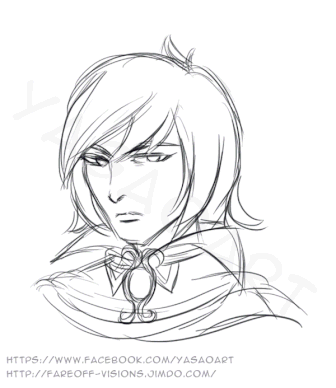
Step 1 - The sketch
The first actual drawing step is of course, a sketch. There's so many different ways of doing so - you could either sketch on paper and scan it, or even in your sketch digitally and scan it afterwards, or you can directly sketch in your drawing program, it's really up to you. For me, all options work - and it really depends on my mood and the complexity of what I'm going to draw.
Since I only wanted to paint some fanart for fun this time though and I rather felt like "doodling", I made a rough digitial sketch. The subject of my picture is Pino from the 3DS game Fantasy Life, by the way ;)
You can find the finished picture here.
First I did some basic sketching to find the shapes I wanted and gradualy added details - I used multiple layers for this and grouped them in a folder, so if I wanted to make some changes, I still woudn't destroy the other lines.
As you see, even my "final" sketch is still rather rough and sketchy, but that's mainly because I personally feel a clean lineart lacks "life. I used to do clean linearts before I went on to
coloring, but I don't do this anymore nowdays - but again, this is a purely personal choice. If you want to ink your sketch first, feel free to do so! :)
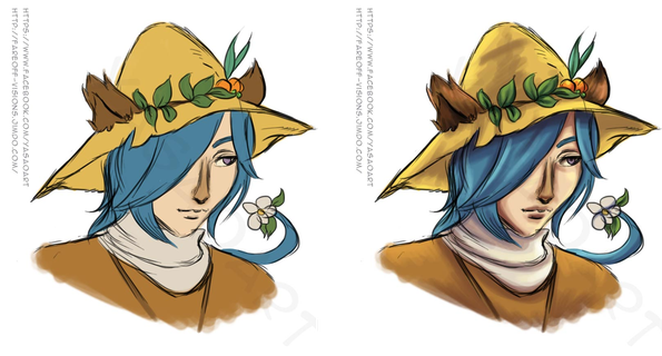
Step 2 - Base coloring
Once I'm happy with a sketch, I put it all in a layer folder named "sketch" and make another layer folder underneath the sketch called "Base" for -you probably can imagine- the base colors.
Some people like to work on a single layer, but I like the freedom of giving each base color their own layer - this makes it easier to change individual colors if something doesn't look right. I
pick mid tones for the base colors and once they're finished, I make even more new layers for some first rough shading. Here I try to develop the values and the shapes by defining where I want
the light and the shadows to be. I don't worry much about blending there yet though, this comes later, for now all I care about is picking the right colors because the tones I add now are the
ones I'll work with later.
[In this example you see that I only pick a few colors - in more complex works there's so many more colors I use, for example various shades of blue and purple to define shadows in portraits. But
since I wanted this to be a quick and easy drawing, I felt those few colors would do.]
Step 3 - The actual painting part
With the base colors set, I'm ready for the most important part: the blending of the colors. This part can get rather tedious, but sometimes it also can be quite fun - but no matter how long it takes and how much work it may be, it's honestly the most important part.
To blend the colors I create a new layer folder above all the other layers - that is, over the base
colors and over the sketch. My idea is that the sketch will still show through, and will serve as a guideline for my painting process, but I'm not limited to it - I can paint over it and make
some last minute changes without much trouble (another reason why I don't like making linearts, they restrict me to staying within the borders, as though I were a little girl painting some
coloring book).
I usually begin painting the skin, because to me, it defines the feeling of the picture most - if I have a painting with a background however, the background comes first because I need to find
the ambient colors I need for shading the character. But since I had a white background here, it was simple and I could immediately start with the skin. Next game the hair, then his clothes and
finally the last details (the flower, the leaves, the fruits and Pino's adorable, furry ears). After I shaded everything, I noticed though that the picture needed some more "fine tuning" to be
finished. More about this in the final step.

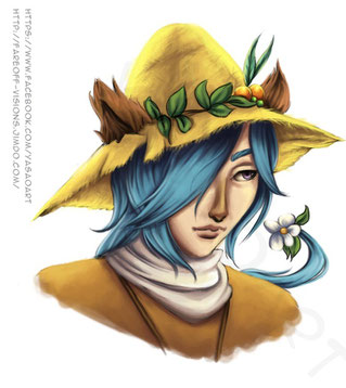
Step 4 - Finishing the painting
Finally most of the drawing is done and I can tend to my favorite part: I call it post production work *laughs*. Basically this means altering colors, adding some more shading via multiply layers
to darken some parts - or also the opposite, adding highlights and additional "light spots" as for example the glint in his eye(s). I feel especially this last thing, the highlights in the eyes,
really makes a character come to life.
It's also the time to add more ambient light, as I tried with the bright yellow - this way, although the picture has a white background, Pino seems as though he's bathed in sunlight, something I find, matches him quite well <3
And that's really all of it. I signed the painting and called it a day - well, or rather night. After all it was 3 am or something when I finished this. I generally feel more creativ at night when no one can bother me and the house is completely silent.
But in any case, this is the complete process of how I painted Pino.
Here's another example where I used the same technique. It's also a piece of fanart from the same game, starring the adorable Daemon - and you can find the finished version of it here.
I hope you enjoyed this little insight into my work - and who knows, maybe it helped or inspired one or two of you ;)
Be sure to let me know what you think, and if you have any questions, be it about my work or something else, don't be shy to ask!
Write a comment
Asaka (Monday, 19 January 2015 13:55)
Why does everything look so easy in WIPs but trying it is much more difficult T___T
But a really cute portait picture and I love the structure of his hat. and the soft an smooth hairstructure<3 + the little lighteffects nice.
I find your tutorial pretty helpful