
Good afternoon, everyone :)
Remember me? *laughs* I'll admit, I've been slacking a little when it comes to posting here on my blog, but those who follow me on Facebook may have seen that I was rather active drawing-wise. I plan on posting more often, though and I have some larger projects planned, so stay tuned >U<
For now, I'd like to present you with one of my most recent aceos - I'll include some WIP photos and I'll also talk a little about a new kind of paint I recently got a chance to try: ShinHan Pass.
Some months ago, I heard of ShinHan Pass for the very first time - according to what people told me, it was supposed to be some kind of "hybrid paint", meaning that it has both, the transparent look of watercolor if used with lots of water and the opaque qualities of Gouache, if used with less. It sounded intriguing to me, even though at that point I did not have much experience with the latter (or rather, make that none at all. The only time I dabbled with Gouache was during an exam in school, when we had to make some concept sketches for an abstract painting with that paint, but I found it dreadful x'D Probably because 90 Minutes isn't enough time to get acquainted with a new medium, plus abstract art isn't necessarily my forte, either).
Time passed and a fellow aceo artist sent me some Gouache samples, upon which I gave them a try and painted this landscape. As it turned out, using this kind of paint was quite...Intuitive for me, it felt a little as though working with Acrylic colors, only that it dried faster, but also had the advantage of being water-soluble, which meant I didn't need to worry about the paint drying out on my palette. Now I'm really not that experienced in Acrylics, either, it's been years that I touched mine (though I want to change that if I have time! *laughs* Watching too many Bob Ross videos lately made me want to paint landscapes), but even so, I enjoyed painting with Gouache and also ordered a small starter kit, so I can practice with it some more in future.
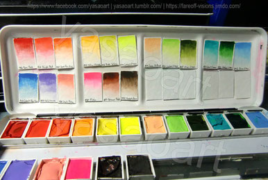
But let's get back to the actual subject of this blog post: seeing how other artists I know created such stunning and vibrant paintings with those ShinHan Pass paints, I really wanted to give them a try as well (those who know me, are aware that I'm generally quite the collector when it comes to different brands of colors) and fortunately, star-behind-the-moon agreed to share hers with me, so I was able to acquire a little set to start out with :)
Even whilst creating swatches I was almost a little...Intimidated at first by how utterly vivid they were (you can't really see it on the photo, but the pink for example has such a bold shock-pink, much like neon tint of a highlighter) - that and they're really highly pigmented, hence it was enough to briefly dip the tip of my brush into the paint to have a full, intense shade of color.
There was only a teeny, tiny problem I was faced with...
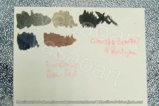
...I didn't have my beloved Ultramarine Blue, nor Burnt Umber *laughs* See, I'm someone who doesn't like to use pre-mixed black or grey watercolor paint, so I always mix mine with those two colors, but without them, I needed to look for alternatives.
Here you can see some of my test-swatches where I attempted to mix black with either of the two blue and brown tones I had, but...Meh. Neither of both seemed to work, the closest I got was Cobalt Blue + Vandyke Brown (the first swatch), but it was too green-ish. But since my knowledge in color theory told me that red neutralizes green, adding some Permanent Red did the job :D
With my mixes prepared, I was ready to start sketching.
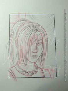
I decided to go for a simple portrait of my Dragon Age Origins OC Yasao to test my new paints and though usually I would prepare a sketch digitally, print it and then trace it, this time I worked in pencil (I need to practice to do this more often anyway >.>; I sometimes feel like I forgot how to sketch on paper, doing this in Photoshop instead is so much easier and makes me feel more secure. It has an "Undo" function and if I mess up, no one can see the "proof" of my failure - aka. there's no torn&crumpled piece of paper which has been tossed over my shoulder in frustration X'D).
And oh my - I was SO happy with the sketch! o_o So I immediately took out my light table and traced the lines onto watercolor paper (Saunders Waterford High White, 190gsm, Hot pressed. I recently discovered this paper and I love it sooo much *O* it's so smooth and since it's so thin, tracing my lineart on it is so easy ♥). Silly me forgot to take a picture of the lines though *laughs* I'm sorry.
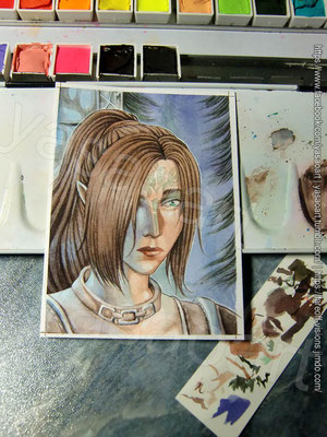
Below you can see my painting process and as per usual, I included some information on the single steps in the captions :)


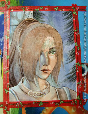
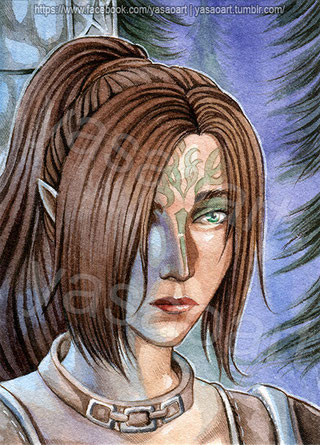
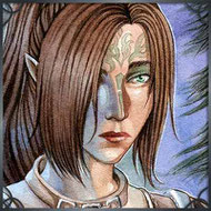
And so it was done - here's the scan of the final drawing ♥
I can't even express how happy I am with the portrait - the eyes, especially, contain so much emotion, don't you agree? >///< In this scene, right before Yasao becomes a Grey Warden, she
struggles with herself, she just saw two men die right in front of her very eyes and she knows there's a chance she might be next. Part of her thinks she deserves this fate, after all
she failed her best friend, but another part of her tries to be strong, she tells herself, if she
will survive, she'll dedicate the rest of her life to her new duty - and all of this is reflected in her gaze.
I also like how the blue light turned out >///> I must admit, I absolutely admire artists who can use such colored lighting effects, it's something I really want to practice a lot more, too.
As for the ShinHan Pass colors themselves...They behaved so well! Even though I was a little shocked still about how little paint I actually needed to mix my shades, I quickly got used to it and I believe I might just buy some more tubes sometime (I definitely need a dark blue, a dark purple and another brown for example).
I think next time I work with them, I'll try to take a little more advantage of their opaque abilities, my painting almost ended up looking like a standard watercolor painting. XD
Still, I do hope you enjoyed reading this post - leave me some feedback below if you like ♥ I'd really appreciate it.
Write a comment