Making of "You couldn't kill me..."

Hello my esteemed readers ♥
Today I am back with a brand new "Making of" post - I'll let you see how I painted an Aceo of the shieldmaiden Lagertha from Vikings in watercolor. I will also ramble a little about her and the show, so if you're only here for the art, ignore the text and simply take a look at the WIP photos *laughs* I also included some behind the scenes information about my "new" coloring style in the second half, so it might be worth reading for all those who are interested in it.
Ahhh Vikings - epic heroes, well staged (sometimes rather gory) battles, a great soundtrack, witty dialogues, authentic-looking sets as well as wardrobe and loads of drama, what's not to love about this TV show? Granted, the nudity and mature content can be a little hard to bear at times (I prefer my TV shows to be a little less...Well, naughty. It's one of the reasons why I never really got into Game of Thrones) and I'll admit that this was why I was a bit sceptical when a dear friend of mine first told me of Vikings, but as soon as I gave the series a chance, I was immediately captivated by the story of Ragnar, his sons, friends and foes. However, despite the fact that Floki's wackiness amused me and it was interesting to watch how Athelstan changed over the course of the episodes, there was one other person who caught my attention right from the start and who easily became my favorite: Lagertha.
Those who know me well, are aware that I'm generally rather picky when it comes to female characters and the reason for that is simple: it really irks me when women serve but one purpose, namely playing the damsel in distress. Thus, when I saw Lagertha in the first episode, being surrounded by a few awful guys who thought she was easy prey now that her husband wasn't home, I immediately knew she was special. Rather than calling for help or getting terrified, she kept her calm and eventually told them "You couldn't kill me if you tried for a hundred years", before...Well. Kicking their butt, so to speak *laughs* She's a shieldmaiden, after all.
Througout the entire series she proved time and time again that she's not only a strong warrior, but that her resolve and spirit is just as firm. She has to deal with so many struggles and difficulties, for example when her husband basically betrays her with another woman (urgh, let me tell you, I can't stand Aslaug =_=) or when she fights to reclaim the throne of Kattegat. She also suffers so much loss, both, when it comes to her family, but also whenever she seems to be happy and finds new love, said person ends up meeting a terrible fate D: (for spoiler's sake I'm not going to go into deeper detail here, but let's just say that the second half of the fifth season really broke my heart >///< Heahmund 😭). But still, even in the face of so much pain and sorrow, she keeps fighting, she never gives in and keeps going - sadder, but wiser.
On a more personal note, it's especially that latter aspect of Lagertha that really inspires me most. My own last relationship didn't really "end" well and though it's been many years ever since, I'm still unable to deal with what happened, so in a way, I can relate with what she's going through and really admire her inner strength.
But aaanyway! Enough talk, now that you know why I like Lagertha so much, let's get to the arty part of my entry :)
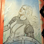
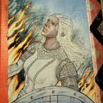
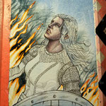
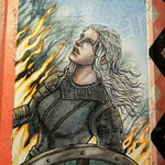
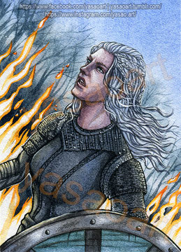
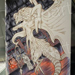
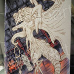
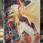
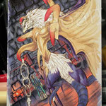
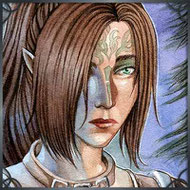
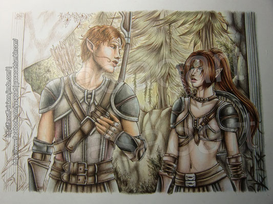
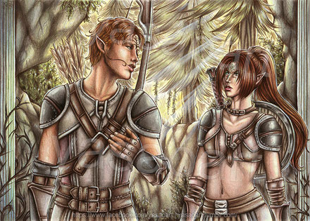
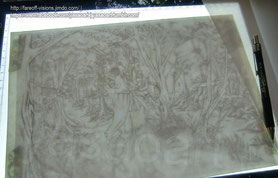
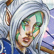
Thanks to an Aceo event themed around Vikings in the German Aceo community I finally got the chance to create some fanart. It's something I've been meaning to do for quite some time and aside of a card of Athelstan (and another upcoming one showing Ragnar's sons) I absolutely HAD TO paint Lagertha. It wasn't easy to decide on a scene though, let alone a design - she simply has so many nice outfits and don't get me started on her beautifully complex hairstyles. Whilst doing my research I eventually discovered wonderful close up pictures from the very episode that had reduced me to tears previously (Seasons 5, episode 15 "Hell") and since I adore her white hair, I finally decided to paint her like that, in battle. The background is also based on said episode, I utterly loved the contrast between the flames and cold, blue light, even though that presented me with a challenge: how the heck am I supposed to paint the fire?! I'd never done that, not on such a large scale. Yeah, I did portray mages with some flames before, but a wall of fire? Nope. In the end I figured the best way would be to to leave the fire white and add some colors later to make it glow.
In the following series of pictures you can see the whole process of painting the background. As per usual, I included some information in the captions :)


Well, who would've thought that I was ever going to use fluorescent colors on a painting like this? 😂 Originally I only wanted to use plain orange poster color because as I said, I wasn't happy with the rough edges and hoped some opaque paint might cover them up, but thanks to this 'experiment' the fire really seemed to glow even brighter.
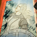
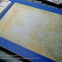
Now, with the background finished, it was time to move on to painting Lagertha, this however, came with its very own, different challenges, which I'm going to talk about in a second.


Here's a close up of her face from a previous WIP photo - as you can see I took great care to leave hard edges here and there to define her facial features, plus I also added the same blue I used for the sky to the mix, amongst other colors. And that's where the other challenge I mentioned comes into play.
See...As of late I haven't been exactly happy with my way of painting characters. I've always strived to have a semi-realistic art style and even though I've changed the way I draw people by practicing a lot, the colors...Well. Remained flat and the skin especially was way too smooth. It was as though someone took a photo and put it through some blurry filters, just like those super-smooth celebrity faces you see on magazine covers - pretty, but not realistic. Of course I'm not aiming to achieve a photo-realistic style, don't get me wrong, but...No. I really wasn't happy with what I was doing anymore.
Maybe the change isn't quite that apparent to some of you, but if you compare this to some of my older paintings, you will notice that I'm really trying to be a bit more bold with the hard edges and the colors I use. I no longer paint the shadows first either and add more than one color to the "base wash" now, including some "odd" tones like green to desaturate certain areas, while glazing thin washes of red over areas like the cheeks or the nose, where blood would show through the skin. It's still not perfect and needs some more practice, but it's my attempt at painting a little more realistic. To tell the truth, I was already a lot happier with how I painted Lagertha's skin here - but it also took three times as long. 😅


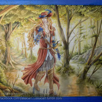
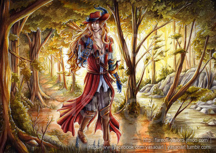
Oh my. I made it - I finished painting Lagertha. But I do have to confess that the result is even better than I imagined. I'm so happy that the effect of the fire came out exactly as I had planned in the end and I learned so much when it came to painting the shieldmaiden herself. But this was only another step on my journey of improving my style of painting, I look forward to see how it'll develop in future - I will keep practicing ^_^
I do hope that you also enjoyed reading this post (or at least looking at the pictures *laughs*). As always, if you like, you can leave some feedback in the comment section - thank you so much for reading! See you soon ♥
Making of "Pterya"
Greetings, everyone ♥
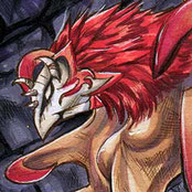
Once again I return with yet another "Making of" post, this time starring an aceo of a very special creature from a game that tends to get me nostalgic: Valefor from Final Fantasy X. I figured some people might like to see how I created this fanart using my trusty Copic Markers :)
Ah, nostalgia. It's something strange, don't you agree? That odd kind of fondness for something you used to adore, but haven't dedicated your time to in ages, but as soon as you see it, you start to feel quite funny and can't help but smile, as all those wonderful memories return to you. That's how I felt when I saw that there was going to be a trading card event centering around Final Fantasy X.
Some may not know this about me, but I've actually used to be a huge fan of the Final Fantasy series and for many, many years it's accompanied me and my creativity. It was what I used to enjoy drawing most, but then various things happened (including the loss of a very special person) and suddenly thinking about it made me sad and...Well. I just stopped playing the games and largely avoided drawing fanart of it. Years went by, I found a new fandom which offered me the comfort I sought and I guess it also helped me heal a little bit, because as I said, when I saw that FFX-themed event, all I remembered were the good times I spent in that world.
I fondly recalled the hours upon hours of playing Blitzball, grinding the levels of my team so even Yuna could one-hit enemies with a simple strike of her magic wand and of course the many beautiful places and all those intriguing characters. No, there was no question about it, I had to participate, I really wanted to draw some fanart.
Before I knew it, I had painted the Mi-ihen Highroad, next followed a scene of the young Auron and Jecht in Besaid (which was rather amusing to paint, especially considering that back then I never imagined I was ever going to draw Jecht at all) and then...Well. I challenged myself.
The event had three categories, one being characters, another landscapes and the last was creatures&summons, which presented me with a problem: I never really drew monsters before :'D; Of course I could pick the easy way out and draw Shiva, but she's so popular, I was certain another participant of the event was going to draw her... That and I kinda wanted to draw Isaaru, after all he's of my favorite characters, but I already had an aceo for the characters-category, so what should I do? Well, the answer was: sneak said character in the background and put the focus on his summon! X'D
Conveniently I remembered the scene in Bevelle where the group encounters him and has to fight three of his summons: Grothia (Ifrit), Spathi (Bahamut) and Pterya (Valefor). With that idea in mind, I had found the perfect setting for my card ♥ After that, the rest went quick. I looked at many, many reference picture and immediately knew I was going to struggle with Ifrit's beast-like features and that it was going to be just difficult to draw Bahamut (and fit him Isaaru in one picture), that's why eventually I picked Valefor. Since it's a harpy-like creature with a rather human body, bird-like feet, as well as face and bat-wings it should be manageable.
Anyhow, now that you know how and why I decided to draw Pterya, I'll let the pictures do the talking for me ♥ Of course, as per usual, I added some additional information in the captions :)
That's it for now, I hope you enjoyed reading my post and liked looking at the WIP pictures. As always, you can leave a comment if you like, I'd appreciate it :3 Thank you! ♥


Making of "Becoming A Grey Warden" & Review: ShinHan Pass
Good afternoon, everyone :)
Remember me? *laughs* I'll admit, I've been slacking a little when it comes to posting here on my blog, but those who follow me on Facebook may have seen that I was rather active drawing-wise. I plan on posting more often, though and I have some larger projects planned, so stay tuned >U<
For now, I'd like to present you with one of my most recent aceos - I'll include some WIP photos and I'll also talk a little about a new kind of paint I recently got a chance to try: ShinHan Pass.
Some months ago, I heard of ShinHan Pass for the very first time - according to what people told me, it was supposed to be some kind of "hybrid paint", meaning that it has both, the transparent look of watercolor if used with lots of water and the opaque qualities of Gouache, if used with less. It sounded intriguing to me, even though at that point I did not have much experience with the latter (or rather, make that none at all. The only time I dabbled with Gouache was during an exam in school, when we had to make some concept sketches for an abstract painting with that paint, but I found it dreadful x'D Probably because 90 Minutes isn't enough time to get acquainted with a new medium, plus abstract art isn't necessarily my forte, either).
Time passed and a fellow aceo artist sent me some Gouache samples, upon which I gave them a try and painted this landscape. As it turned out, using this kind of paint was quite...Intuitive for me, it felt a little as though working with Acrylic colors, only that it dried faster, but also had the advantage of being water-soluble, which meant I didn't need to worry about the paint drying out on my palette. Now I'm really not that experienced in Acrylics, either, it's been years that I touched mine (though I want to change that if I have time! *laughs* Watching too many Bob Ross videos lately made me want to paint landscapes), but even so, I enjoyed painting with Gouache and also ordered a small starter kit, so I can practice with it some more in future.
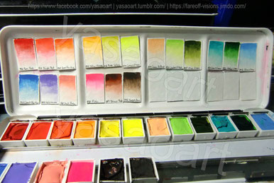
But let's get back to the actual subject of this blog post: seeing how other artists I know created such stunning and vibrant paintings with those ShinHan Pass paints, I really wanted to give them a try as well (those who know me, are aware that I'm generally quite the collector when it comes to different brands of colors) and fortunately, star-behind-the-moon agreed to share hers with me, so I was able to acquire a little set to start out with :)
Even whilst creating swatches I was almost a little...Intimidated at first by how utterly vivid they were (you can't really see it on the photo, but the pink for example has such a bold shock-pink, much like neon tint of a highlighter) - that and they're really highly pigmented, hence it was enough to briefly dip the tip of my brush into the paint to have a full, intense shade of color.
There was only a teeny, tiny problem I was faced with...
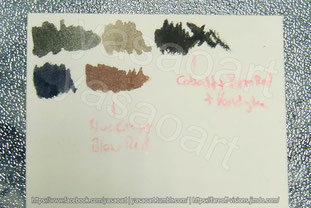
...I didn't have my beloved Ultramarine Blue, nor Burnt Umber *laughs* See, I'm someone who doesn't like to use pre-mixed black or grey watercolor paint, so I always mix mine with those two colors, but without them, I needed to look for alternatives.
Here you can see some of my test-swatches where I attempted to mix black with either of the two blue and brown tones I had, but...Meh. Neither of both seemed to work, the closest I got was Cobalt Blue + Vandyke Brown (the first swatch), but it was too green-ish. But since my knowledge in color theory told me that red neutralizes green, adding some Permanent Red did the job :D
With my mixes prepared, I was ready to start sketching.
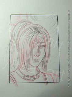
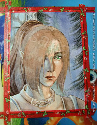
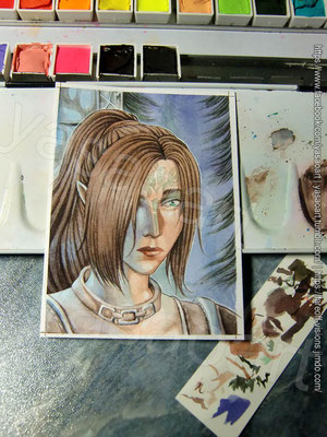
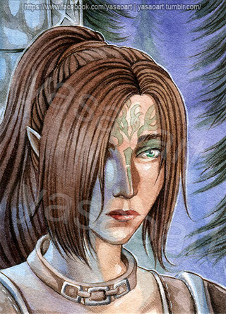
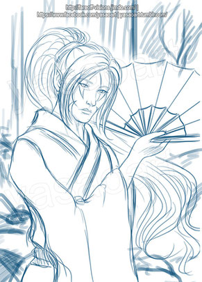
I decided to go for a simple portrait of my Dragon Age Origins OC Yasao to test my new paints and though usually I would prepare a sketch digitally, print it and then trace it, this time I worked in pencil (I need to practice to do this more often anyway >.>; I sometimes feel like I forgot how to sketch on paper, doing this in Photoshop instead is so much easier and makes me feel more secure. It has an "Undo" function and if I mess up, no one can see the "proof" of my failure - aka. there's no torn&crumpled piece of paper which has been tossed over my shoulder in frustration X'D).
And oh my - I was SO happy with the sketch! o_o So I immediately took out my light table and traced the lines onto watercolor paper (Saunders Waterford High White, 190gsm, Hot pressed. I recently discovered this paper and I love it sooo much *O* it's so smooth and since it's so thin, tracing my lineart on it is so easy ♥). Silly me forgot to take a picture of the lines though *laughs* I'm sorry.
Below you can see my painting process and as per usual, I included some information on the single steps in the captions :)


And so it was done - here's the scan of the final drawing ♥
I can't even express how happy I am with the portrait - the eyes, especially, contain so much emotion, don't you agree? >///< In this scene, right before Yasao becomes a Grey Warden, she
struggles with herself, she just saw two men die right in front of her very eyes and she knows there's a chance she might be next. Part of her thinks she deserves this fate, after all
she failed her best friend, but another part of her tries to be strong, she tells herself, if she
will survive, she'll dedicate the rest of her life to her new duty - and all of this is reflected in her gaze.
I also like how the blue light turned out >///> I must admit, I absolutely admire artists who can use such colored lighting effects, it's something I really want to practice a lot more, too.
As for the ShinHan Pass colors themselves...They behaved so well! Even though I was a little shocked still about how little paint I actually needed to mix my shades, I quickly got used to it and I believe I might just buy some more tubes sometime (I definitely need a dark blue, a dark purple and another brown for example).
I think next time I work with them, I'll try to take a little more advantage of their opaque abilities, my painting almost ended up looking like a standard watercolor painting. XD
Still, I do hope you enjoyed reading this post - leave me some feedback below if you like ♥ I'd really appreciate it.
Making of "How dangerous could it be?"
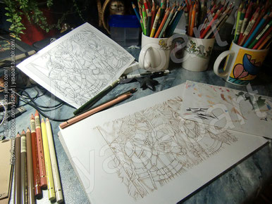
Hello everyone :) It's been a while that I posted something here, but I'm back with yet another intriguing „Making-of“ post for you! We've had watercolors last time, alcohol markers (Copics) before that and today it's going to be all about colored pencils, a kind of medium I don't work with all that often and I'm still learning to use properly myself *laughs* I included not only WIP photos, but also a close look on how I create depth by layering various colors.
The picture in itself is something very special to me as well and you'll find out more about why and what it's all about, too in today's post. So please, go on reading if you like :)
“Come on, let’s at least see what’s in that cave. How dangerous could it be?”
“That’s also what you said when you found that supposedly deserted hornet’s nest, remember?” Yasao remarked with a small grin. “And the next moment you went running like a mad man, lest they not sting you.”
Tamlen laughed at that memory – he remembered all too well how he ended up jumping into a pond and how she had finally chased off the angry insects by boldly reaching for a blazing stick from their campfire.
“Well, I know you always have my back.” He replied softly. “Also… Isn’t it you who always wishes for an adventure and a challenging battle to go with it? That’s what may be waiting for us, you know? Do you really want to miss that opportunity?”
Eventually Yasao sighed and went on ahead.
“Fine, you won.”
Maybe you're wondering what you've just read and the answer is simple: this is part of my fan fiction to my absolute favorite game, "Dragon Age: Origins", a brief section of the very first
chapter to be precise ^_^
To those who've been following my art on FB for a while, it shouldn't be that surprising
to hear that I've been writing a story about it (btw, just recently I crossed the 300-pages mark, which means the story's already a stunning 1.000.000+ words long o_o ...And I've only been
writing it since around May last year *giggles*) and I figured, some illustrations for the story were in order.
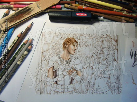
In February I finally finished the first sketch for the exact same scene you've just witnessed: in it, my own character, the elven warrior Yasao Mahariel and her childhood friend Tamlen discovered a mysterious cave which held a terrible secret that was going to change both their lives forever. It's a moment that kind of breaks my heart whenever I think of it, but I simply had to illustrate it.
On the photo above you can see that I printed the sketch out (its roughly A5-sized) and traced it onto larger (A4) paper using sepia ink. As I wanted the color scheme to be in largely brown, grey, green and yellow tones, the lines would thus merge beautifully with the colors.
Furthermore, you can see some of my additional tools on the first photo below: a block of emery paper for sharpening my pencils and a battery-powered eraser for getting rid of unwanted color and adding highlights.


As I've stated in the caption, coloring Tamlen's belts wasn't quite that simple, for I actually had to mix a large number of colors to get the right tone. The colors also included some “odd” colors, such as blue for where I wanted the light to hit the leather and green to dull the brown down a little and make it appear less red. Both are colors I used allover the picture, even on layers such as his skin. Using the same tones on the whole picture really helps to make it all “come together”. Below you'll see the order in which I applied the colors and how they actually looked on paper (you can click the image to see a larger version of it).
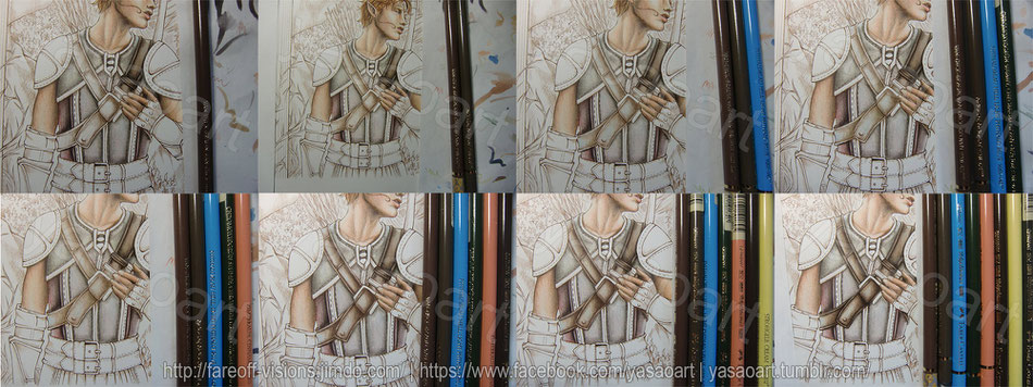
Now that you saw in detail how I mix the right color, you also know how I continued drawing the other areas. For each element I picked at least 3-10 different colored pencils and blended them by layering them very lightly. Sometimes people will also use tools like blending stumps to smudge colors or might add things such as paint thinner to blend them, but I did no such a thing here (although I DO want to try something like this in near future, I heard of some interesting stuff called “Zest-it” which is supposed to be great for that purpose, but I have yet to get my hands on a bottle of it).
In the picture gallery below you get to observe the various steps until I finished the drawing – read the captions for more information on the single images :)


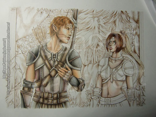


There you go! The scan of the final drawing ♥
I will admit, I'm fairly proud of it, it's the first time in forever that I worked with colored pencils on such a large scale – and I do plan on doing it again soon, there's this drawing of Zevran and Yasao that's waiting to be colored ^_^).
All together the coloring process took me a couple of weeks, but admittedly, there were large pauses in between (in which I worked on other things such as trading cards for other people or
commissions). Still, there were many times where I felt like I was never going to finish it and was about to give up, but I'm so relieved I managed to finish the drawing in the end.
And that's it, now you know the entire drawing process :)I hope you enjoyed following it and will return next time I publish another “Making of" post. Comments are much appreciated, as always – thanks a lot for reading and have a great day!
Making of "Levant Shandaer"
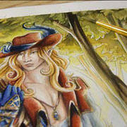
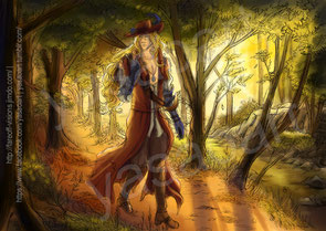
Good day, dear friends and readers :) I am very excited to present today's "Making of" post to you, as it's about a painting which means so much to me and I will admit that it's also one I am rather proud of.
As some of you may know, I participated in the OC Anthology artbook project , a book dedicated to "original characters", created by many wonderful artists. The character I chose for this artbook is one of my most beloved ones, the half-elven bard Levant Shandaer from my novel Broken.
In this article you will see how much planning and work is behind the final version that finally made it into the printed artbook. Please enjoy - and do feel free to comment.
I will confess, when I first applied to the project last year and eventually got in, I was rather...Intimidated. There were so many amazing arists with incredible skills and I was afraid my entry was...Well, going to be a little "pale" in comparison *laughs*. But I decided to give it my all, to see how far I can go and what I can do, if I put my mind completely to it. That's also why I planned on taking my time and giving each and every step, from the first draft to the final piece utmost care.In the end the whole painting took about one month to complete - you will soon see why. Let us begin with the "Making of - Levant Shandaer" - originally painted in winter 2015 and kept secret until today. ♥

The artwork was meant to depict a scene from Levant's life, so I took some time to contemplate how to represent him best. He's a wandering bard and also a fugitive in a way, so I decided a scene from his journeys was going to be most suitable. Also, since I wanted him to look solitary and a little wistful, I intentionally refrained from drawing any other hints of company, be it human or in the shape of animals (although I did originally plan to place a bird on the branch and have him look that way).
It took quite some time until I finally got the composition I wanted - and as usual I did so by creating a rough sketch in Photoshop. It's easier for me to work digitally at this early stage, because the given software tools allow me to resize and shape the various elements of the picture better, until I am satisfied with it. Were I to work traditionally, it would mean having to erase and redraw a lot, or possibly having to redraft the entire piece and I want to save myself the frustration *laughs*.
Once the composition was roughed in, I had it printed in color, twice, in fact. One print showed the drawing in its entirety, background, character and all, and the other had Levant alone, without a background, in full A4 size (thus, around two time larger than he was going to be in the actual piece). I don't usually do this, actually I always do one sketch of the whole drawing, but I wanted to pay close attention to every detail this time. That's also why the next part took twice as long, but was no less crucial: the pencilling stage.
I figured a digital sketch only would look "artificial", so it was rather important to me to do the actual drawing (which was later going to serve as the base for the watercolor-painting) traditionally, in pencil. Only after I finished the two seperate sketches, I scanned them, merged them and lo and behold - I had my final "lineart". But the real work was only just going to begin.
Click on the pictures below to see larger, more detailed versions of the drawings.


Goodness gracious me. What have I done. So many details x.x
...One look at the finished sketch I'd printed and I already knew how difficult it was going to be to transfer it to watercolor paper. So, in order to procrastinate and avoid having to do this -- I mean, err, of course to properly prepare the painting (totally meant to write this, ignore the first part ^_^;;; ) I decided a color concept was in order.
Now THIS is a step I will sometimes do, especially with large pictures and those that have a complex light and color scheme. Planning ahead here makes it easier to pick colors later whilst painting (or drawing) and assures that I will get the mood right in the end. I create this concept in Photoshop as well, in a small thumbnail version, I don't pay attention to details here, the only important part is the mood I want to express. As you can see I went for autumn colors which would go nicely with Levant's clothes and the back-lighting was going to lend him a slightly unearthly "glow". He is, afer all, not entirely human.
Alas, I could not avoid this step forever *laughs*. As tough as it was going to be, I had to transfer the sketch onto my watercolor paper at some point. Unfortunately for me, my watercolor paper seems to be extremly stubborn, however. Meaning: it's too thick for me to even be able to spot every line, thus clusters of details become blotchy dark spots on the paper. That way, "tracing" ends up being actual redrawing. Well, it's not like it didn't take an enternity to draw this the first time, did it? Wait. It did. Oh. Great. *Sarcasm on*
After I fiiiinally finished the tracing-part and put away my light-table, I briefly contemplated whether I should ink the drawings or leave it be - but in the end the latter was my choice, simply because erasing the pencil after inking was otherwirse going to "injure" the surface of the watercolor paper (and I swear it absolutely wasn't because I didn't feel like retracing every single line AGAIN *coughs*).
Now the painting took me on a brief quest to our basement, seeking fo a nice wooden board - why, you may wonder? Well, to secure the paper onto it, of course! Masking tape does that job quite well - it doesn't only create a nice white "frame" at the edges afterwards, but it also makes the paper buckle a little less when water is applied.
In the following galery you will see the complete painting process from the first washes 'til the finishing touches. Commentary on the single steps is included in the captions.


And there you have it. The final painting.
It was a long way until I finished it in early January 2016 and my, it was quite some experience. I learned so much whilst painting it, also since I had not worked on such a large format in quite some time... And to tell the truth, there were many moments when I wanted to give up or thought it wasn't going to be any good, but in the end it was worth every moment I spent on it.
Honestly...Now, that I can hold the artbook in my hands and browse through the pages, seeing all the beautiful drawings everyone did, I can't help but smile. Everyone did so well - and in the end my fear that my drawing might be not "impressive" enough, didn't come true either. I was so happy when the other artists, many of whom I admire, complimented me on my painting. And although I really don't often say this, I am really proud of myself. I challenged myself to do my best and I managed to create a painting which I never thought possible. Of course I still have a lot to learn and my style is far from "perfect", but I can wholeheartedly say that I am happy about my painting ♥
Now, enough sentimental blabbering *laughs* I hope you enjoyed this little insight behind my painting and I would appreciate it if you leave me a comment, either here, or on my facebook page what
you thought of it :)
Thanks for reading, and see you soon!
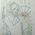
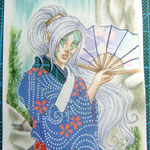
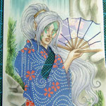
Making of "Takio Kadan"
Greetings, my dear readers ♥ I'm back, with yet another "making-of" post, showcasing the creation of one of my most recent aceos, this time starring my sweet OC, the one and only Taki--- err,
Hidetomo *laughs*
This handsome mage from my novel Broken is quite distinctive, thanks to his pretty markings, his yellow eyes and his fondness for
folding fans, as well as kimono - but this time, I thought of something special. Instead of drawing the patterns for the fabric, I created them using origami-paper, using a technique I learned
from a friend.
Ah, my Hidetomo - it's always a pleasure to draw him! I don't know how many drawings I did of him, but I think amongst the characters of my novels, I probably drew him the most (and he's only rivaled by my darkelven main character Vyon).
Naturally, I also wanted to dedicate an aceo to him again, so I quickly decided on a simple, but elegant pose and found a setting befitting my precious Hide: a garden, with a waterfall behind him, some rocks here and there... Yes, I figured, this would create the perfect atmosphere, without stealing the viewer's attention from him (he hates that, you know? *laughs* He always wants the attention to be on him, and him alone :P).
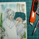
Once the sketch was done, I contemplated how I was going to color it - and there I remembered a talk I previously had with my friend Sakaki. She had told me of how to use pattern paper effectively in creating aceos - and since I have a large collection of origami paper (because I love folding paper cranes ♡), I wanted to give it a try as well.
In the gallery below you can observe the creation process in its entirety - and let me tell you, it was painstaking! The lineart and the coloring was the easy part really, but having to cut out
every single section, each one at a time, then picking the perfect piece of paper and glueing it in place from behind the card was quite tedious. But I believe the ultimate result was worth all
the cussing, the sticky fingers and the near despair (because once I thought I cut too far and ruined it 😅).
Still, I don't think I'll be repeating this anytime soon *laughs* But painting in watercolor will be nice too, am I right?
Aaanyway ♥ That's it! I hope you enjoyed today's post - as always, feel free to write a comment.